Enabling easier claim submissions and collecting information to automatically adjudicate pet insurance claims
Timeline
Dec 2023 - Feb 2024
Company
Pumpkin
Platform
Web


Before our redesign, users encountered several challenges with our current claim form: an unintuitive and outdated UI, lots of text, difficulty distinguishing between types of claims, and more.


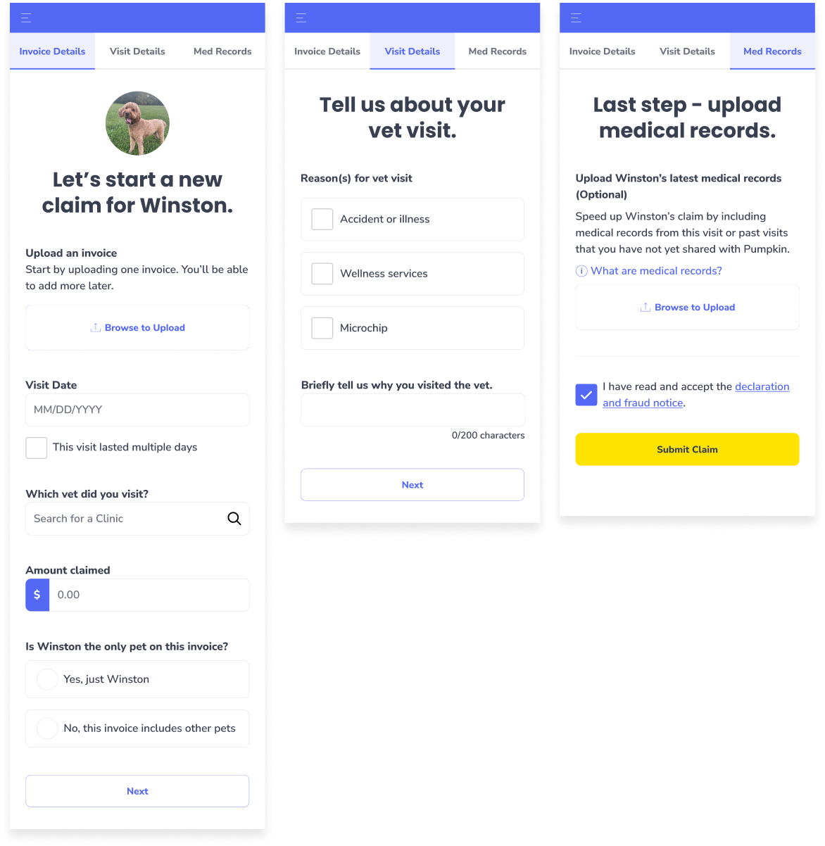
One dimension I explored in my designs was the structure of the submission experience. In the early version shown above, split the form across multiple screens, but this led to a disjointed experience, with users losing their place in the form and perceiving it to be longer than it actually was.


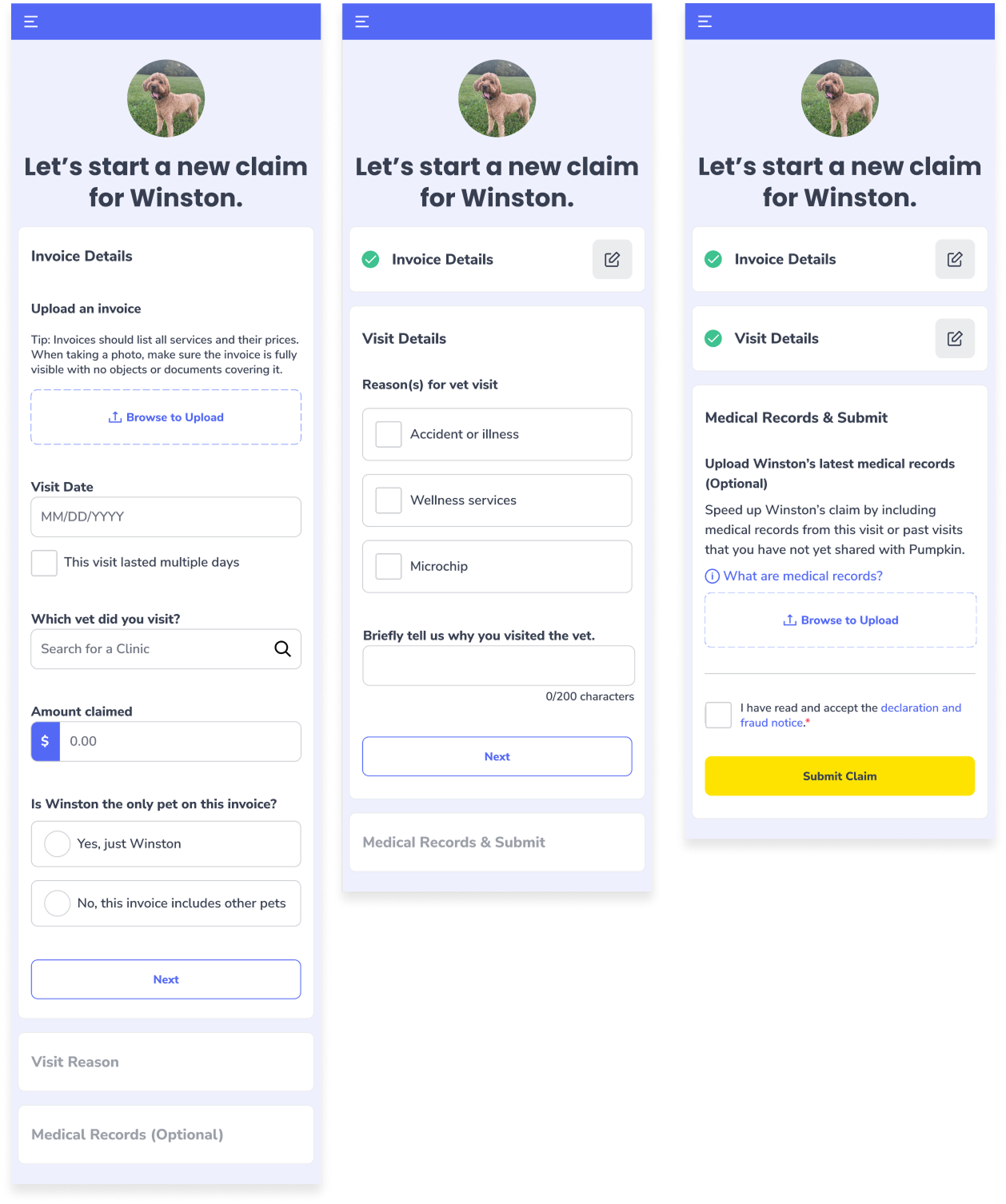
As I moved up in fidelity, I attempted to strike the right balance of helping users see their place in the task of filing a claim, while also helping them focus on the current step in the process.
Due to firm deadlines to start automating claims, I had to be smart about the time I allocated to discovery. I leveraged insights from observing user sessions in Full Story and incorporated customer feedback from previous research to rationalize design decisions.
I also used my team's shared knowledge, getting feedback from stakeholders on the current claim form.

How can we simplify our claims experience for customers while ensuring they feel confident in the information they've provided?
Align form with a user’s mental model of claims while fulfilling requirements for automation
Provide education in context, and give personalized next steps, to inspire confidence
Modernize the UI, creating new components to be used across our design system
Fix known issues with our current claim form

By progressively layering fidelity—from maps to wireframes to final UI—I continuously engaged my team and stakeholders. This approach kept us aligned on the design vision while addressing evolving technical requirements for automation.


Before beginning high-fidelity designs, I created wireframes with content blocks to align my team & stakeholders behind my vision for the claim form, and ensure my PM and tech lead could provide me with feedback on automation requirements and feasibility. I held a session with my PM to discuss which features were must-have, should-have, and nice-to-have.
New Component Specs: Uploader

New Component Specs: Typeahead Search

Some examples of the detailed specs I created for engineers to understand the new components that were added to the design system. New components were built with future use cases in mind.

Customer experience with the claims process has already improved due to increased efficiency enabled by automation. Even with the addition of new fields to the claim form, there was no adverse effect on NPS, indicating the enhancements were well-received.
Revisiting the experience for customers viewing and tracking claims was outside the scope of this project, but is an important consideration that I hope to tackle in the near future.